Is Your Website Costing You Customers on Mobile? Find Out.
Is Your Website Costing You Customers on Mobile? Find Out.
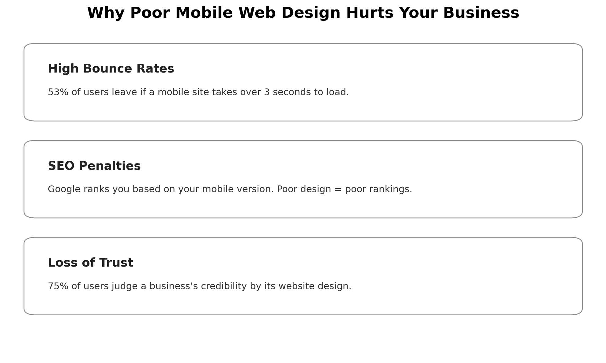
Business Implications of Poor Mobile Web Design
Increased Bounce Rates and Lost Revenue
Damaged Brand Perception and Trust
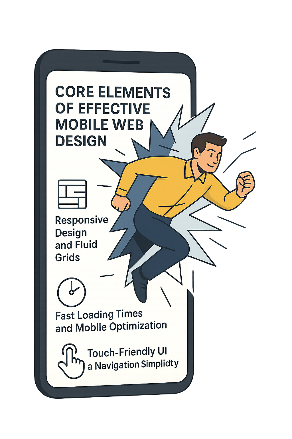
Core Elements of Effective Mobile Web Design
Responsive Design and Fluid Grids
Fast Loading Times and Mobile Optimization
Touch-Friendly UI and Navigation Simplicity
Mobile Web Design Trends in 2025
The Cost of Ignoring Mobile Web Design
Real-World Examples of Business Losses
Customer Trust and Credibility Issues
Expert Insights: What Industry Leaders Say
Predictions for Mobile-First Business Strategies
Integrating SEO with Mobile Design
Title and Meta Tag Optimization for Mobile SERPs
Leveraging Insights from Lookhin4 SEO Title Guide
Mobile Schema Markup and Structured Data
How to Get Started: Mobile Design Checklist
Design Considerations for 2025 and Beyond
In 2025, mobile web design isn’t just important—it’s everything. With the majority of your audience scrolling on smartphones, a clunky mobile site can crush your credibility and kill conversions. Mobile design isn’t just about resizing—it's about speed, simplicity, and creating a seamless experience users love. Over the last decade, mobile took over the web, and now Google rewards mobile-first sites with better rankings. If your site isn’t lightning-fast and thumb-friendly, you're leaving money on the table. Want to stay competitive? Start with mobile—or get left behind.

Business Implications of Poor Mobile Web Design
Increased Bounce Rates and Lost Revenue
More than 53% of users abandon a site that takes longer than three seconds to load on mobile (Think with Google). Slow speed, cluttered interfaces, and poor navigation all contribute to high bounce rates and abandoned carts. A site that isn’t optimized for mobile usability kills conversions before they even start. If you’re not delivering a seamless experience across devices, you’re handing your leads—and revenue—to someone else.
SEO Penalties from Google
With mobile-first indexing, Google now ranks your site based on its mobile version (Google Search Central). A site that isn’t responsive, lacks fast loading, or fails Core Web Vitals tests won’t just struggle with visibility—it’ll drop out of search entirely. If your business depends on online discovery, poor responsive design is costing you clicks, impressions, and authority.
Damaged Brand Perception and Trust
Design is trust. According to Stanford research, 75% of users judge a business’s credibility based on its website design (Stanford Web Credibility Project). Outdated or broken mobile layouts make your business look careless—or worse, unprofessional. In a crowded market, perception is everything.
Don't wait until your traffic disappears or your rankings tank. Your competitors are already optimizing their mobile web design for speed, structure, and performance. Don’t be the brand they leave behind. Let Lookhin4 help you fix it now.

Core Elements of Effective Mobile Web Design
A high-performing mobile website isn’t just about shrinking things to fit smaller screens—it’s about rethinking how people use your site on the go. Whether you're running an eCommerce store, service-based business, or SaaS brand, these core principles of mobile web design will keep users engaged, your site ranking, and your brand looking sharp.
Responsive Design and Fluid Grids
True mobile web design starts with a responsive layout—a structure that adapts to any screen size without breaking or crowding the content. Fluid grids use flexible columns and relative units to ensure your site looks balanced whether someone’s on a 4.7" phone or a 12" tablet.
At Lookhin4, we design with mobile first in mind. That means we don’t retrofit desktop layouts—we build flexible structures that flow intuitively across devices. It's not just design—it's mobile-first development that works.
Fast Loading Times and Mobile Optimization
Speed isn’t a luxury—it’s a necessity. Google reports that the probability of bounce increases 32% as page load time goes from 1 to 3 seconds (Think with Google). Optimizing images, minimizing scripts, and leveraging browser caching are all standard practice in our mobile web design workflow.
At Lookhin4, we use tools like Google PageSpeed Insights and Core Web Vitals benchmarks to ensure every mobile site we build is lightning fast, even on slower networks.
Touch-Friendly UI and Navigation Simplicity
If it’s hard to tap, it’s hard to trust. Mobile users rely on touch-based navigation, so your design needs large buttons, clear menus, and minimal friction. Overly complex menus or cluttered layouts frustrate users and tank conversion rates.
We focus on clean interfaces, sticky nav bars, and thumb-friendly buttons that guide users toward action—whether it’s a purchase, a booking, or a lead form. The simpler the experience, the stronger the results.


Mobile Web Design Trends in 2025
If you're still treating mobile web design like a second thought, you're already behind. The future is here—and it's designed for your thumbs, your voice, and your expectations. In 2025, the top-performing websites are mobile-first by default, blending fast performance, smart technology, and human-centered design.
At Lookhin4, we're not just following these trends—we’re building them into every strategy we deliver. Here's what’s shaping the next wave of mobile web design.
AI-Powered Personalization
Artificial intelligence is transforming mobile web design by making it smarter, not just sleeker. In 2025, sites don’t just look good—they adapt. AI helps personalize user experiences in real time, from dynamic content blocks to product recommendations based on behavior.
Imagine landing on a mobile site that already knows what you need. That’s not futuristic—it’s happening now. With AI tools baked into your responsive design, you can drive deeper engagement and higher conversions. At Lookhin4.com, we integrate AI logic right into our mobile web design process, tailoring each interface for maximum impact.
Progressive Web Apps (PWAs)
PWAs are bridging the gap between websites and apps—delivering lightning-fast load times, offline functionality, and smooth interactions that rival native apps. In 2025, a top-tier mobile web design isn’t just mobile-friendly—it feels like an app.
Users expect that kind of seamless performance. PWAs offer push notifications, instant page loads, and improved mobile UX without requiring downloads. For clients at Lookhin4, we implement PWA technology to create high-converting, scalable experiences with future-ready performance.
This is more than a trend—it’s a mobile web design revolution that puts your brand in users’ pockets, every day.
Voice and Gesture Navigation
With the rise of voice search and gesture-based control, the way users interact with their phones is changing fast. In 2025, mobile web design has to work beyond the scroll and tap. Users want to speak, swipe, and snap through your site—and expect it to respond intuitively.
Optimizing for voice and gesture isn’t just about novelty. It’s about mobile accessibility, speed, and convenience. If your site can’t keep up, users bounce. That’s why we build mobile web design frameworks that integrate voice-friendly structure, large tap zones, and swipe gestures—built for mobile-first behavior from the ground up.
At Lookhin4.com, we don’t just build websites—we craft performance-driven, future-ready experiences. If you're ready to upgrade your mobile web design for 2025 and beyond, let’s build something users (and Google) will love.

The Cost of Ignoring Mobile Web Design
Neglecting your mobile site isn’t just a design issue—it’s a business risk. With mobile traffic dominating the web, failing to invest in effective mobile web design can drain your revenue, hurt your reputation, and leave you playing catch-up while your competitors race ahead.
Real-World Examples of Business Losses
One retail client came to us after seeing a 30% drop in mobile conversions over six months. Their site looked fine on desktop but was slow, unresponsive, and confusing on phones. We revamped the mobile layout, optimized for speed and tap targets, and saw sales rebound by 42% in the first 60 days.
Another local service provider had a gorgeous site—but customers couldn’t easily book appointments on mobile. That friction cost them real revenue daily. Once we simplified their mobile UI and made the booking CTA thumb-friendly, their mobile leads doubled.
Ignoring mobile performance costs more than redesigning—it bleeds opportunity every day you wait.
The Competitive Disadvantage
While you’re struggling with outdated mobile pages, your competition is optimizing every click, scroll, and tap. Companies with strong mobile web design see better SEO rankings, higher engagement, and more conversions. Google’s mobile-first indexing means if your mobile site isn’t on point, you’re not even in the game.
Every second your page lags or misaligns is a chance for a competitor to win your customer.
Customer Trust and Credibility Issues
Users form impressions instantly—and 75% judge your credibility based on your site’s design (Stanford Web Credibility Project). A mobile site that’s cluttered, broken, or outdated sends a message: "We don’t care about your experience."
But the opposite is also true. Clean, responsive mobile web design builds trust, increases time on site, and keeps people coming back.
Expert Insights: What Industry Leaders Say
After digging into the latest research, expert panels, and design reports, one thing is clear: mobile web design is no longer just a trend—it’s a business essential. Across the board, leaders in UX, UI, and digital strategy agree that your mobile site isn’t just a version of your desktop experience—it’s your first impression. And it needs to perform.
Quotes from UX/UI Experts
Here’s what top experts have to say:
“If your site doesn’t work flawlessly on mobile, it doesn’t work—period.”
— Luke Wroblewski, Product Director at Google (lukew.com)
“Users form an opinion about your brand within 50 milliseconds.”
— Jenny Gove, UX Research Lead at Google (Think with Google)
These quotes reflect what I’ve seen firsthand. Businesses lose conversions every day because of sluggish performance, poor layout, or unreadable fonts on mobile. Strong mobile web design isn’t optional—it’s survival.
Predictions for Mobile-First Business Strategies
The data backs it up. According to Statista, mobile devices now account for 58.67% of global web traffic—and that number is still climbing (Statista, 2024).
Meanwhile, Gartner predicts that by 2026, 90% of customer touchpoints will begin on mobile-first channels . That means your mobile experience is likely your customer’s first—and possibly only—interaction with your brand.
The best businesses are already responding by:
Prioritizing responsive design that adapts fluidly to screens of all sizes
Applying conversion optimization principles tailored to mobile interactions
Meeting Core Web Vitals benchmarks for mobile load speed and interactivity
Designing from a user experience-first mindset, not just aesthetics
What really stood out to me was how many top brands treat mobile web design as their digital storefront. Everything—from spacing and typography to CTA button placement—is optimized for mobile behavior, not just resized from desktop.

Integrating SEO with Mobile Design
Blending smart SEO with effective mobile web design is more than just keywords—it’s about building a site that performs, ranks, and feels right on every device. At Lookhin4, we believe structure matters just as much as strategy. That’s why we design with intention: every font, color, margin, and pixel of padding is chosen to support usability, speed, and clarity. Mobile users won’t wait—and search engines won’t reward bad design. We optimize both form and function.
Title and Meta Tag Optimization for Mobile SERPs
Search results on mobile are tighter and faster-paced. Your mobile web design needs titles and meta descriptions that are short, keyword-rich, and compelling. We craft each element—down to how it looks in search—to win the click. That means placing your primary keywords early (“mobile web design,” “mobile SEO,” etc.), writing for user intent, and ensuring every headline is as readable on a phone as it is on desktop.
Leveraging Insights from Lookhin4 SEO Title Guide
Our SEO Title Guide is grounded in real performance data. It shows that the best mobile web design strategies include titles optimized for voice search, long-tail variations, and emotional triggers. We apply those insights directly to design—making sure typography, spacing, and layout support scannability and SEO. Because a great title only works if your layout lets people actually read it.
Mobile Schema Markup and Structured Data
Structured data is a game-changer for mobile web design. We integrate schema for local business, articles, products, and FAQs to get your content noticed in mobile-rich results. It’s not just about showing up—it’s about showing up right. Combined with purposeful layout, spacing, and intuitive design, structured data helps search engines understand and highlight your content. The result: better rankings, better user experience, and a mobile site built for growth.
Bottom Line: We don’t just chase SEO trends. We build fully structured, search-ready, mobile-first websites where every detail—from code to color—is designed to perform.

How to Get Started: Mobile Design Checklist
Ready to upgrade your site? Here’s your go-to checklist to build a mobile experience that’s fast, accessible, and future-proof. Whether you're launching from scratch or redesigning, these are the pillars of effective mobile web design for 2025 and beyond.

Design Considerations for 2025 and Beyond
Mobile users expect seamless, intuitive design—and fast. Your layout should prioritize responsive design, using flexible grids, scalable typography, and device-adaptive images. Keep CTAs big, bold, and tap-ready. Stick to clean, minimalist visuals that load fast but still communicate your brand personality.
In 2025, mobile-first design also means preparing for voice search, gestures, and evolving UI patterns. Designing with context—like how users interact on the go—is key. Mobile isn’t a screen size anymore. It’s a mindset.
✅ Prioritize performance and usability
✅ Use mobile-friendly fonts and spacing
✅ Keep content scannable, with clear hierarchy
✅ Design for all screen sizes and orientations
Accessibility and Inclusivity in Mobile Design
Accessible design isn’t optional—it’s essential. Use high-contrast colors, readable fonts, and alt text for images. Navigation should be logical and operable by touch, voice, or screen reader. Making your mobile web design inclusive means more users can access your content—and Google rewards it.
✅ Use semantic HTML and ARIA labels
✅ Avoid small clickable areas
✅ Ensure keyboard and voice navigation compatibility
✅ Meet WCAG 2.1 accessibility standards
Testing Your Mobile Website Effectively
Launch isn’t the finish line—it’s where real testing begins. At Lookhin4, we use tools like Google Mobile-Friendly Test, Lighthouse, and BrowserStack to test sites on real devices. We check for layout issues, loading speed, broken links, and usability on every major platform.
✅ Test on multiple devices (iOS, Android, tablets)
✅ Run page speed and Core Web Vitals audits
✅ Simulate slow networks to test load resilience
✅ Watch real users interact and gather feedback
Want a shortcut? Let Lookhin4 build it for you—the right way, from day one.
More Articles
Mastering Affiliate Marketing: The Ultimate Keyword Research Playbook
B2B SEO Consultant: Driving Growth in Business-to-Business Marketing

